
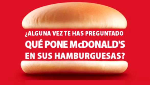
In this post, I would like to demonstrate my desktop publishing expertise by walking you through one of my desktop publishing projects where I localized the following McDonald’s poster from English into Spanish in Photoshop.
I find this poster creative and interesting as the hamburger inside is built with two pieces of bread and three lines of texts shaped like meat. I think it is an innovative idea to combine the image and texts.

The first step to localize this poster is to analyze the source image. The main challenge to localize this poster is that the texts between the breads form a perfect rectangle and look like three pieces of meat inside a hamburger. When these texts are localized into Spanish, I need to keep the original format. This is the same with the yellow texts, which appear as a rectangle below the hamburger image.
Step 1: Hiding Source Texts
In order to hide the source texts, I used the “marquee” tool to select all the texts that need to be replaced. Then, I used the “eyedropper” tool to copy the color in the background and used the “bucket” tool to fill the boxes selected by the “marquee” tool. In this case, all localizable texts are hidden as below.

Step 2: Importing Target Texts
For texts between the two breads, I adjusted kerning and font size so that the whole texts can form a perfect rectangle. Since the Spanish texts are longer than the English ones, I need to shrink the overall font size to make all the texts fit in three lines.
There is something worth pointing out here. In the original poster, the word “McDonald’s” comes with the largest font and takes a whole line. But as the Spanish texts are longer than the English ones, the “McDonald’s” word cannot take up a whole line in Spanish. So, I put some other words in the same line with “McDonald’s”, but still kept “McDonald’s” the largest words in the whole text box.
Another tricky part is that in Spanish, the usage of punctuation is different from that in English. For instance, there is only a single question mark by the end of a sentence in English, but in Spanish, whenever there is a question, we need to put two different question marks at the beginning and the end of the sentence respectively. Some of the English fonts don’t support this difference in punctuation, so I need to find similar Spanish font to replace the original one.
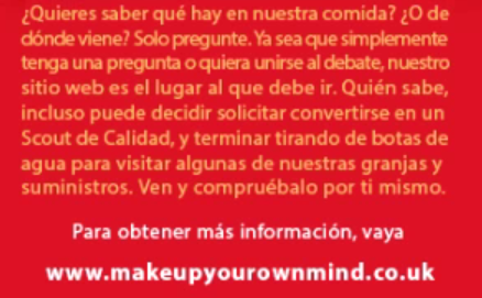
Then, for the texts below the hamburger image, they form a rectangular box too. So, when I localized this part, I used line break and adjusted the kerning to make the text layout look better.
For the final two lines, there are located at the center in the original poster. In my localized version, I also put them at the center so that the formats of the source and target poster match.
This poster also introduces the issue about localizability check. For instance, the website link at the bottom should not be localized. This is also something we should take into consideration when translating files.
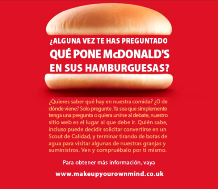
The final localized version is shown below. It looks pretty much the same in format with the original poster.
You can also check out the walk-though video below to find out more details about how to localize a poster like this one in Photoshop. All the steps mentioned above are also included in this video and you can check out the functions I used in Photoshop UI.
Hope you find this post useful! Have fun localizing your own posters~
DTP Project Showcase (panopto.com)